
Yomm — A Daily Inspo App for Women
OVERVIEW
This project was done on behalf of a client called Momentum - an organization that works to empower women to change the world through Jewish values that transform themselves, their families and their communities.
ROLE
UX Designer
Content Designer
Project Manager
TEAM
Verticalloop

The problem
My team began working Momentum at the early stages of their project. Their vision was bold and concrete: to create a social networking app designed to cultivate deep connections among Jewish women around the world. When they approached us, they were feeling stuck and unhappy with the creative direction of the app.
We picked up where the other agencies left off.
There was a lack of clarity on how to effectively integrate educational content and social networking features together into a single user-friendly, engaging app.
Additionally, understanding the specific requirements and preferences of the target audience remained a key concern as the demographic included a potentially less tech-savvy persona.

My role
I was the main designer on the team. I was responsible for the product design and UX/UI experience for the app. Some of my key achievements were:
Conducting in-depth user research. I delved deep into understanding our target user, their preferences, behaviors, needs, and challenges to gain valuable insights that informed the development process.
Initiating design sprints to inform our process. I was able to effectively apply the design sprints process to identify the problem, ideate on the solution, prototype and implement the final product.
Designing and organizing content. I created a seamless and user-friendly experience (both for brand designers and users) that not only enhanced accessibility but also ensures clarity.
Executing end to end. I created in depth spec documentation for each feature and flow so the development team could code and create as efficiently as possible.
Direct communication with key stakeholders. I met weekly with the Project Manager, the Development team, and Business Consultants.
Advocated on behalf of the user. Advocating for the user is like adding a dash of empathy to the design recipe – it turns a functional dish into a delightful user experience soufflé.

Understanding the target audience
Based on my research into dozens of educational and social networking apps and the analysis of the prior research conducted for the Yomm app. I determined a target audience for the app:
Jewish women between the ages of 30-65 located around the world
People who don’t feel close to the religion but would like to form a deeper connection with others / sense of personal growth
Parents / mothers
Basic knowledge of how to use a smartphone
I then created a persona — meet Melanie. Melanie is a 40-year old mother of two kids, she works as an attorney and identifies her Judaism level as unaffiliated-Reform. She doesn’t consider herself to be very tech-savvy (and doesn’t really have the patience for it either).
Her goals are:
Be able to provide a basic Jewish education and connection for her kids
Keep Jewish holidays
Feel close to religion
Connect to a like-minded community

Ideating
SOLUTION: Create a user friendly platform that serves as both educational and a social network.
Recognizing my persona's needs, I determined a solution that allows users to browse content in video, audio and text formats from top tier educators and create personal connections and relationships based on that content.
APP MAP

WIREFRAMES


Designing
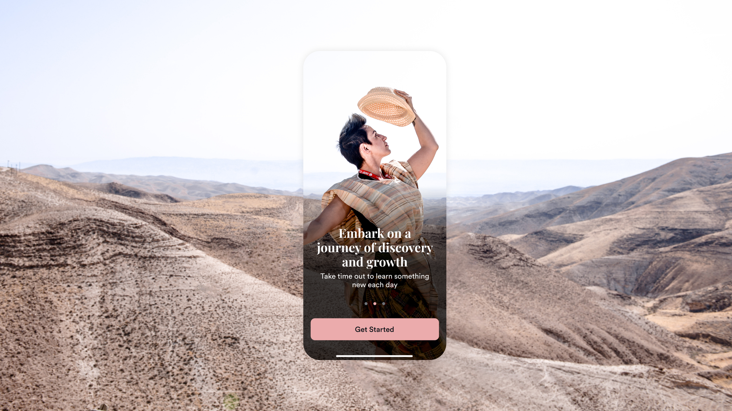
The app starts with an onboarding process that allows the user to provide basic information about themselves. After completing onboarding, the user will be asked to select three or more topics that they are interested in learning about from a curated list.
The stakeholders emphasized the importance of content first in the newest version of Yomm. We took the leap and decided to bring the amazing content to the forefront of the app instead of the UX we previously had which was a bit more constricted and demanded the user go through many steps before reaching the content.
Now, on the Home screen (called Feed) the user can browse carefully curated content in a random order or they can choose to explore content by checking out different Journeys (themed playlists) as before.

After solving the content piece, we move on to tackle the question — now, how can we add the social aspect and bring women to connect through the content?
After many sprints, we decided the best way to connect women was to have a forum like page for each of the main onboarding topics. Users can join and leave, participate or just read as they please.
To add an extra layer, we also developed a group chat feature. When creating a group chat, women can invite others in the app (or friends outside the app) to this chat where they can link a Journey. Simply put, this means they can work through the content together and have meaningful conversations in a safe space.

Results & takeaways
Yomm is now available on iOS and Android. It offers inspiring content from educators like Noa Tishby and Kelly McGonigal. The app's user-friendly interface connects women and provides daily inspiration. With features like calendar sync and reminders, it's easy to make Yomm part of your daily routine.
Some of my key takeaways from this project are:
Focus on building a solid MVP. With a solid foundation, it is much easier to build on different concept and features as the app advances along the way.
Focus on the users problem. It is our users pains that we will be solving for so keeping that front of mind is important as it's easy to lose sight of this when trying to meet all demands.
Don’t make the users work too hard. Depending on the goal of the app, it’s important to bring the “meat” to the front. Don’t hide important features or great content beneath levels and clicks.

